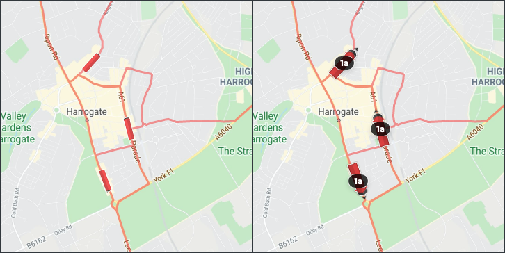
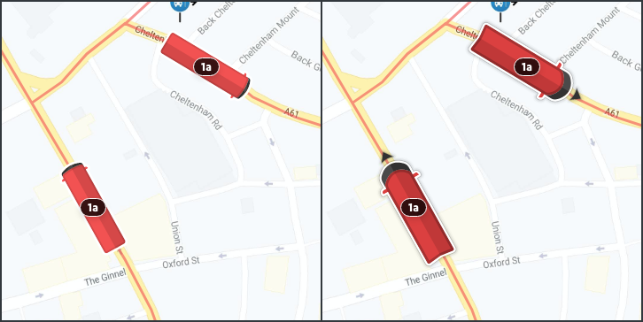
This update brings some minor tweaks to the recently updated vehicle icons based on feedback from end users. These updates aim to make it easier to find the service you’re looking for, as well as distinguish its direction of travel at a glance.
Firstly, due to the rectangular shape of the buses, some users found it harder to tell the direction of travel compared to the older “teardrop” icons, so we’ve added arrows in front of each vehicle to make this clearer.
We’ve also adjusted the width to height ratio of the icons, and added a subtle shadow beneath each one. The new shorter and wider icons, in conjunction with the shadow, makes them much easier to see against the drawn route line that they travel along, especially when viewing them at a high zoom level.
Lastly we‘ve made some adjustments to the scaling of the icons as users zoom in and out. The icons never drop below a minimum size, and we no longer hide the icons or the route numbers above a certain zoom level, so users can always view their bus no matter how far they zoom out.


As ever, we’ll continue to monitor feedback and evolve the vehicle tracking to make it as easy as possible to use for as many users as possible. If you have any questions, please do get in touch.
