
Over the last couple of months, we’ve been releasing updates to Passenger websites that are designed to help improve their accessibility.
Improving accessibility benefits all website users, both with and without disabilities, by ensuring everything is easy to see and understand.
As an operator, this will also be important if you are looking to apply for Inclusive Transport Committed accreditation.
Keyboard control of journey planner inputs
One of the areas that has had the most focus for improvement is our journey planner. By ensuring the inputs for this feature can be used easily with only keyboard control, and that all the information given can be understood when read by a screen reader, a journey can be planned by almost anybody.
Screenreader improvements for timetables
Service timetables have also been improved for screen readers, so that when a user navigates around the table using a screenreader, the context of the timetable cell selected is understood by the reader and is now read out to the user. In this case the context is the stop name and the line name, and without this, the table can be difficult to use for those reliant on the table being read to them.
Changes to colour contrasts
In our latest update, we have ensured that text and form inputs are legible by increasing the contrast between foreground and background colours.
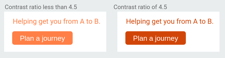
We have done this by closely following the Web Content Accessibility Guidelines 2.1, which tell us that a contrast ratio of at least 4.5:1 for normal text is required to meet AA standards. Likewise, a contrast ratio of at least 3:1 is required for interactive elements.
For those colours that fall below the 4.5:1 contrast ratio, they have been adjusted to meet the correct contrast ratio. In the overwhelming majority of cases, the change is so subtle you’d hardly be able to tell the difference unless viewed side by side, as shown in the example below.

However in rarer cases, you may find that a colour is now noticeably darker or lighter than it was before.
In some cases, the outline of interactive elements have been made stronger to help users identify that they can be interacted with.

Consideration for colour contrasts for operator brand
Each Passenger website has been reviewed for colour contrast between its text and background and where this could cause issues with legibility, and to see whether it meets AA and AAA standards using the color.review tool.
We have automated this process to highlight any area that does not meet the contrast ratio and calculate the nearest acceptable colour, using a tool known as a stylesheet preprocessor.
Below (left) is a screenshot of the Cardiff Bus website, with the areas that did not meet the contrast ratio circled in red. On the right, is the resulting page after the automated colour corrections had been applied.
Here we see several changes, most notably that the orange background has been altered so that the white text has enough contrast.
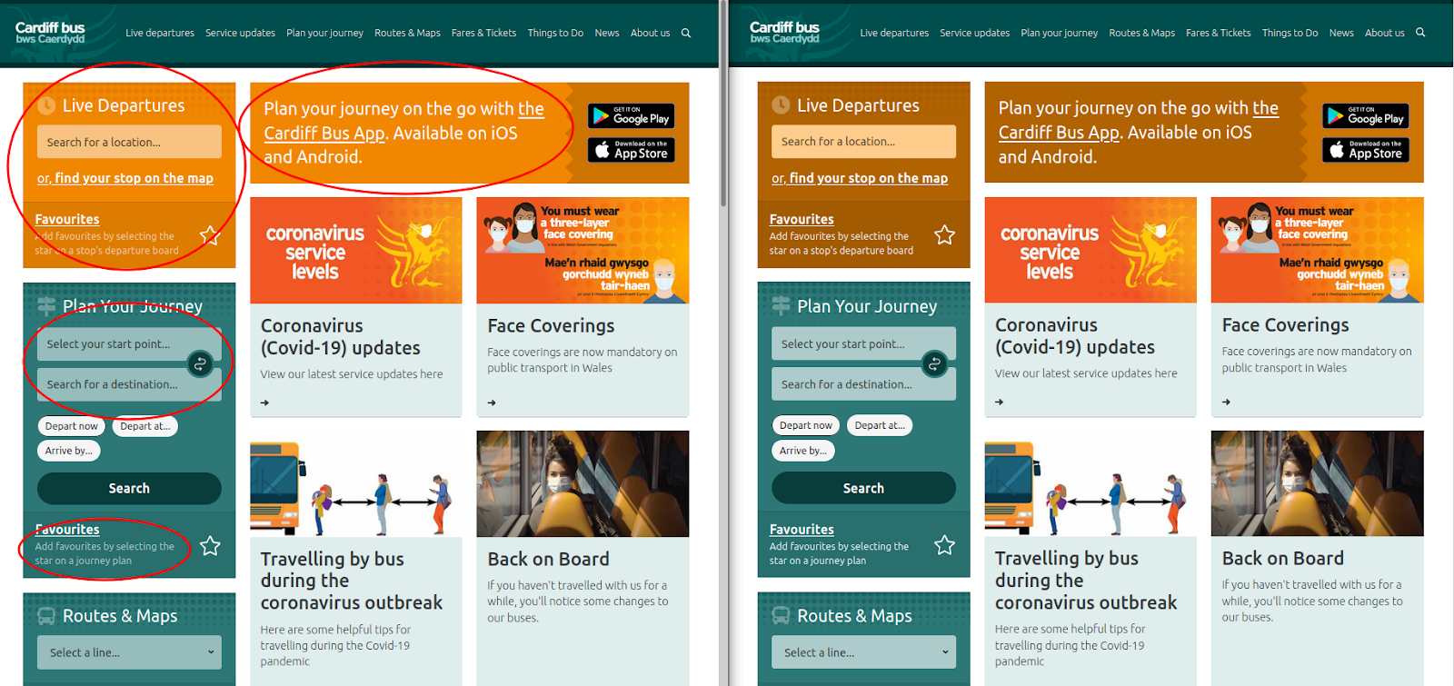
Although this page now meets the colour contrast guidelines for accessibility, the orange colour, which is an important part of Cardiff Bus’ branding, has been altered to become more of a brown.
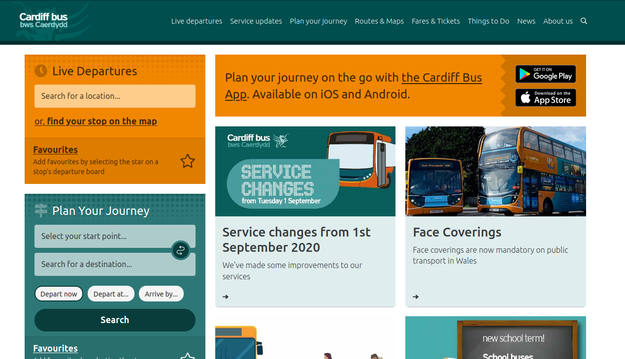
To retain the important brand colour, a better solution was to alter the colour of the text, with a dark brown text providing a much higher contrast ratio than the white text did against the orange, meeting both AA and even AAA standards.
If you have any questions about these improvements or would like any assistance with ITLS accreditation, then please don’t hesitate to get in touch.
You can also read our recent blog post on improving access for website users.