Improvements have been made to Passenger Cloud’s look and feel to ensure the application continues to be easy to use as we introduce new features.
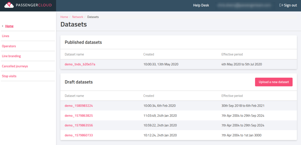
Section titles and other navigation elements – such as the sidebar – now clearly show what is being displayed and how to get to other pages.
Key actions, such as create, upload and delete, have been made easier to find. These are now prominent buttons found near the content that they will affect. See the ‘Upload a New Dataset’ button in the screenshot below.

The home page has been adjusted so that the whole of each section can be clicked.

We’re working to improve more areas of Passenger Cloud, with additional changes coming over the next few weeks.
