
When navigating through Passenger Cloud on a desktop screen, there is a menu on the left-hand side which provides links to subpages within the current section. As an example, the “Network” page has links to “Lines”, “Operators”, “Vehicles” etc.
When viewed on a mobile device, there is less screen space available and no room for a permanent side menu. Instead, subpage links are collapsed behind a button.
Previously, on mobile, this button was labelled as “More options” and was located across the bottom of the screen.
In the latest release of Passenger Cloud, this button is now labelled “Menu” and is located at the top right of the screen.
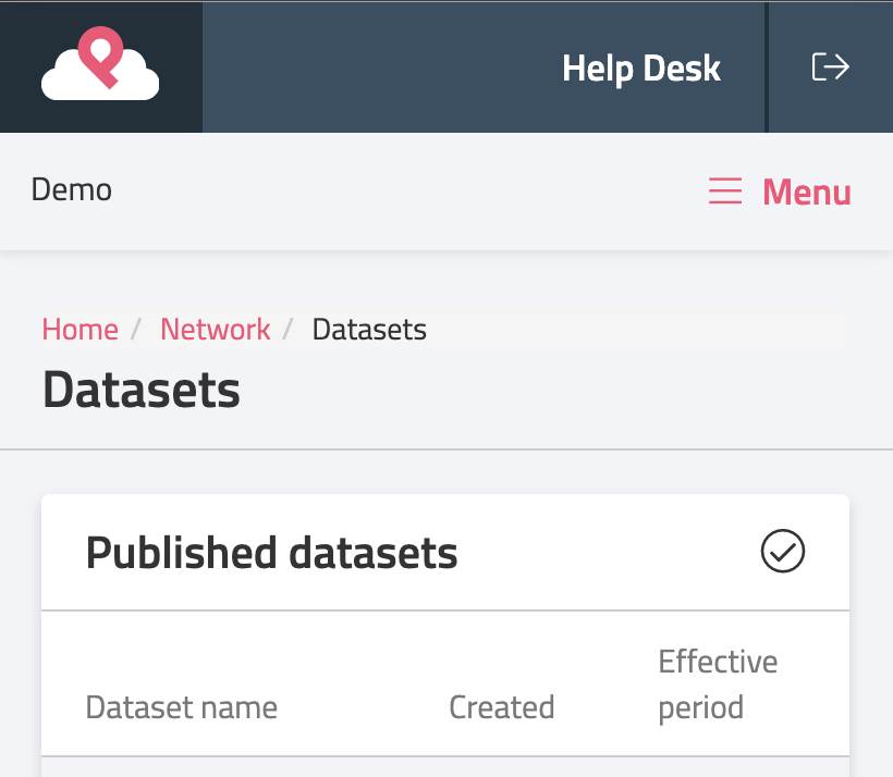
Menu when closed 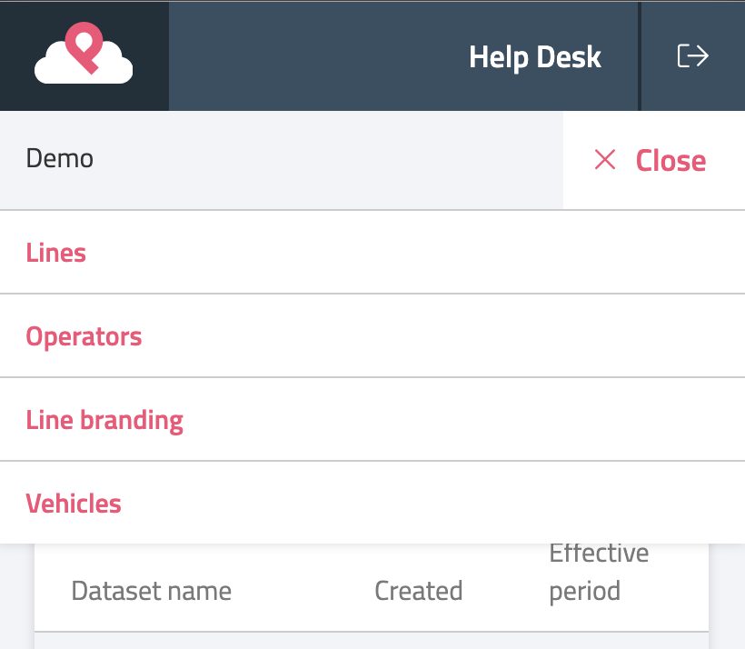
Menu when opened
The “Menu” button will only appear when a page has subpages to link to, therefore not all pages will show the “Menu” button. No changes have been made to the side menu on the desktop view.
The new design a more familiar interface for the menu, similar to those found in other mobile web applications and mobile apps, for a more intuitive user experience.
As always, if you have any questions at all you know where we are.