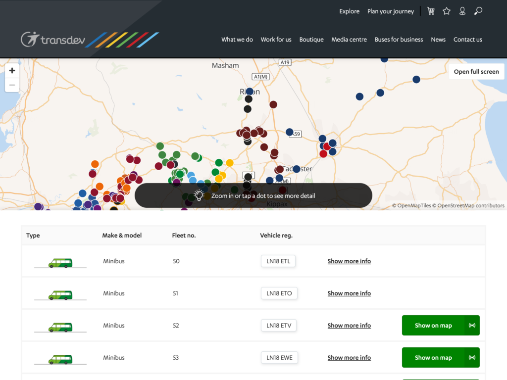
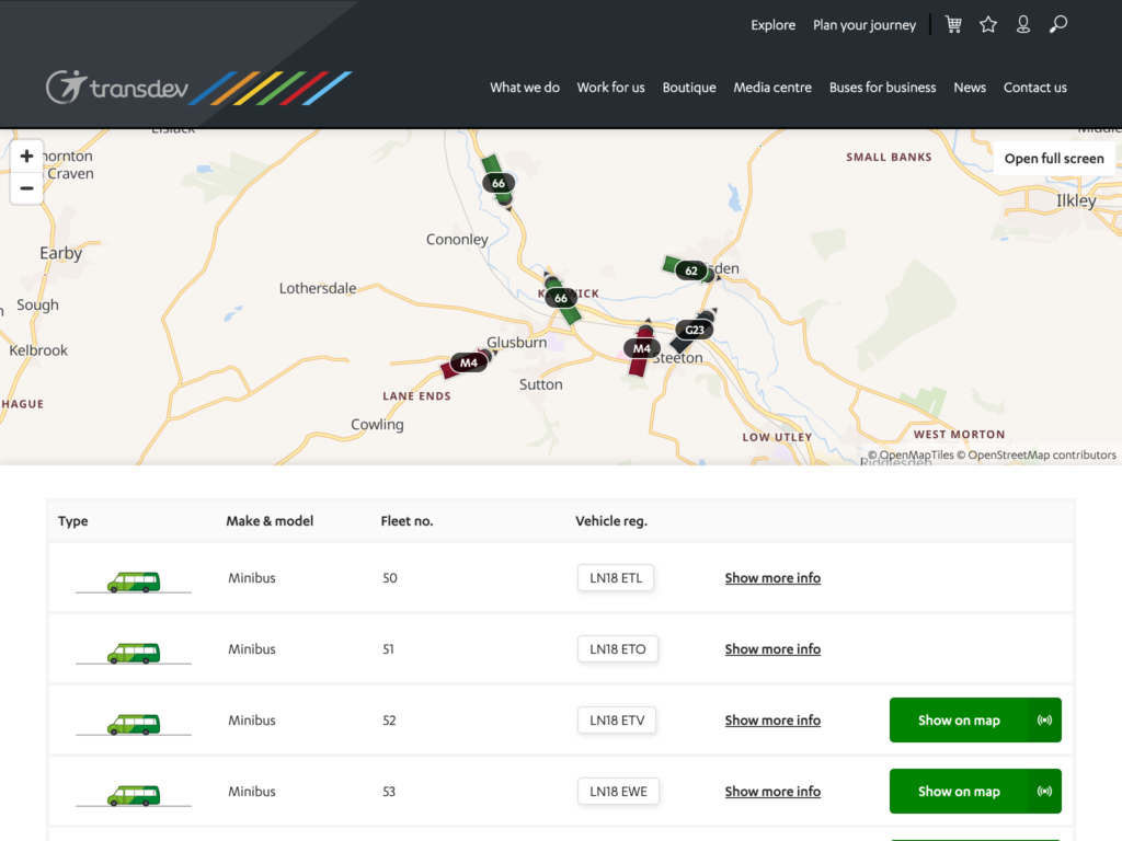
We’ve made improvements to the Fleet List map to improve performance.
At low zoom levels, with many vehicles visible, the map will display each vehicle as a simple circle, to maintain performance in the users’ browser.

At high zoom levels, with few vehicles visible, each vehicle will display as a detailed icon, displaying bearing (if available) and the service name.

This change is specifically aimed at operators with large numbers of vehicles out on the road but will benefit all operators. If you have any questions at all, please do get in touch.
