
New page layouts
In 2018 we updated feature pages to make the most of large imagery with the use of a large image banner stretching the full width of the browser window, when viewing from a desktop. This image followed the 2:1 image ratio we had established across websites.
However, when used full width it came with a trade off – it either meant displaying the page content over the image (obscuring parts of it) or pushing content beneath the image (often leading to content not being clear).
We opted to cover a portion of the image as we felt it gave the page much needed impact while allowing the content of the page to be viewed without requiring the user to scroll. In reality, it has been tricky for content editors to find images that work well in the layout as the main focus of the image is often completely obscured.

To preserve that imagery while introducing unique branding to each page, we are changing the way that banners display. We are releasing an update that will improve the layout of feature pages (including Attractions, Events, Offers), Contact pages and Passenger App pages that have a featured image.
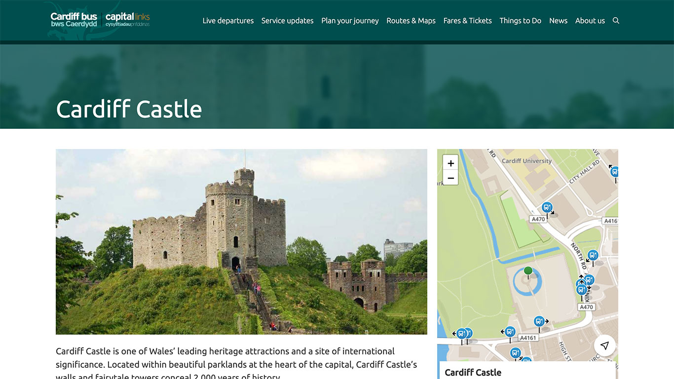
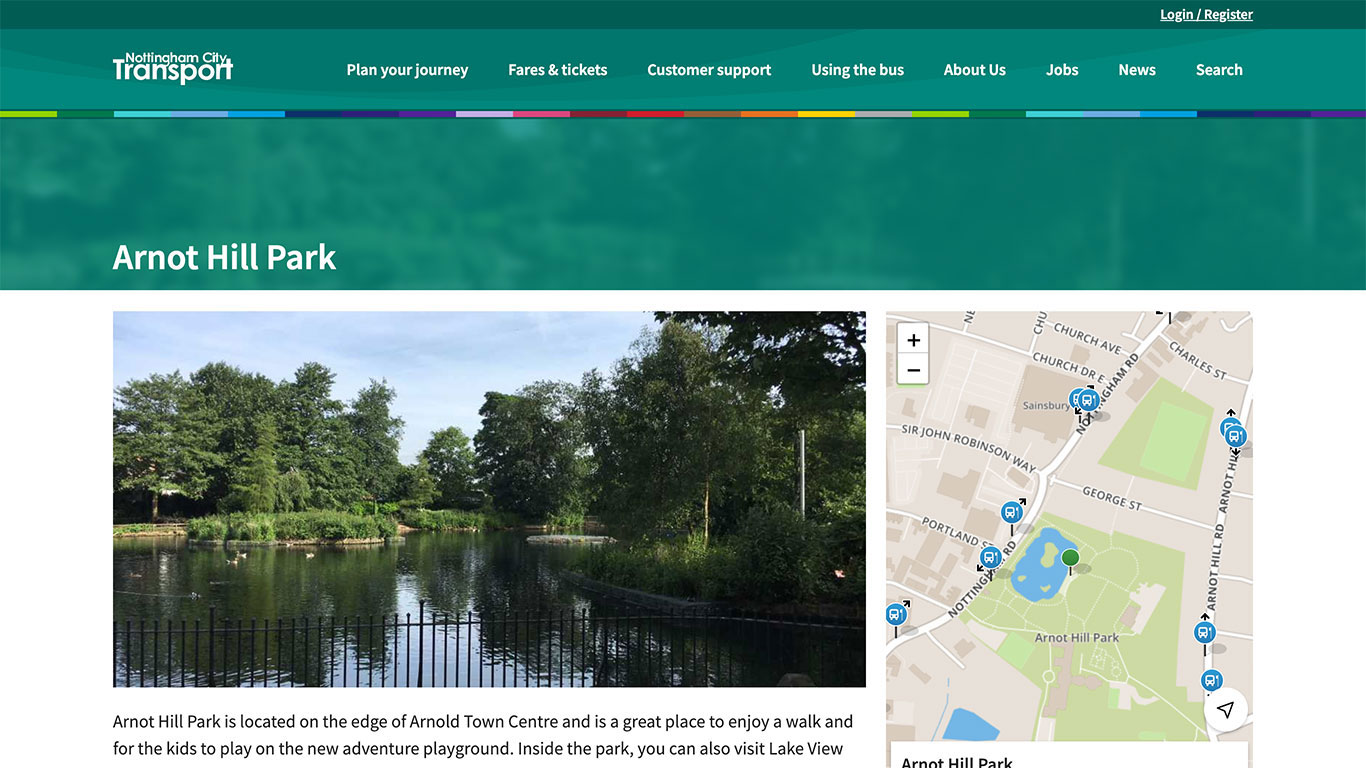
On desktop, this new layout takes the same 2:1 feature image, but crops it to fill a much narrower banner. We then stylise the image further by applying colours from your branding to give the page just as much impact as it had with the previous layout.
We then include the featured image within the body content, completely unobscured, for users to see in its full glory. Adding the image to the body content has also allowed us to add improvements to accessibility.
Images should continue to be uploaded at 2:1 ratio and you don’t need to make any changes to already uploaded images.
Mobile layouts of these pages will not change. This change is part of our programme of continuous improvements for the web apps.

Easily visible markers
Additionally, we have released an update that increases the size of the dropped marker. Feedback from users indicated that the small marker was lost easily on a large desktop environment and blended in amongst the stop icons.
The new icon is bold and large, indicating a clear location, either from the user clicking on the map to drop a marker or from a Search input.

We will begin rolling out these changes beginning 21st January.